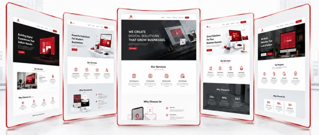
A visitor opens your homepage and sees elegant visuals, smooth animation, and a confident headline. But after scrolling, they still cannot explain what you sell, who it is for, or how it would help them.
This is where an attractive website can lose its purpose. Every section should answer a useful question, from “Is this relevant to me?” to “What happens if I contact you?” Clear content gives the design something meaningful to communicate.
01 / FIELD NOTE
Your Opening Message Should Give Visitors Their Bearings
People arrive with different levels of knowledge. Some already know your business. Others have opened a link with very little context.
Your opening section should help both groups understand where they are.
A headline can have personality, but the surrounding description needs to explain the offer. “Built for What’s Next” might sound confident, yet it does not tell a visitor whether you provide software, recruitment, accounting, or construction.
Pair an expressive headline with a concrete explanation. State what you do, who you help, and the practical need you address. Visitors should not have to scroll through several sections to uncover the basics.
02 / FIELD NOTE
Write Around the Customer’s Situation
Businesses often describe their services from an internal perspective: departments, tools, capabilities, or industry terminology.
Customers usually begin with a situation.
They may be receiving enquiries they cannot manage, running a website that is difficult to update, or spending hours repeating administrative tasks. Content becomes easier to understand when it connects your service to that starting point.
For example, “Custom workflow automation” names a capability. Explaining that it can move enquiry details into the right system and notify the responsible team shows how that capability might help.
Use examples that reflect what you actually deliver, without suggesting every customer will achieve the same outcome.
03 / FIELD NOTE
Give Each Service Its Own Explanation
A row of service names can help visitors browse, but it rarely gives them enough information to decide.
A detailed service page should explain:
- The situations the service is designed for.
- What the work usually includes.
- Which parts depend on the agreed scope.
- What information or access you need.
- How the project or engagement progresses.
- What the client receives.
04 / FIELD NOTE
Turn Features Into Understandable Value
Technical details can be useful, particularly when buyers need to compare options. But a feature becomes more meaningful when its practical role is clear.
An editable content system means a team can update approved parts of the website without requesting every change from a developer. A booking integration can help visitors choose an available appointment through a connected process.
Avoid attaching a dramatic benefit to every feature. Explain the relationship honestly, including conditions or limitations where they matter.
The aim is to help people understand why a capability exists and whether it is useful for their business.
05 / FIELD NOTE
Give Every Section a Different Job
Content becomes repetitive when every section makes the same promise using different words.
A stronger page follows the visitor’s decision:
- The opening explains the offer.
- The problem section helps visitors recognise their situation.
- Service details explain what you provide.
- Process content explains how the work happens.
- Examples provide evidence.
- FAQs address remaining concerns.
- The final action explains how to begin.
06 / FIELD NOTE
Make the Page Easy to Scan Without Making It Shallow
Many visitors scan before they commit to reading.
Useful headings should communicate the subject of the section, rather than simply announce “Our Excellence” or “Our Difference.” Short paragraphs make detailed information more approachable. Lists work well for genuinely parallel information, such as inclusions or requirements.
Put the most useful explanation near the beginning of each section. Readers should be able to understand the main point quickly and continue into the detail if it matters to them.
A page can be substantial and still feel clear when the information is organised thoughtfully.
07 / FIELD NOTE
Use Buttons That Explain the Next Step
A button creates an expectation.
“View Our Work” suggests examples. “Request an Estimate” suggests an enquiry process. “Book a Consultation” suggests scheduling. The destination should match that promise.
Generic labels can work when the context is obvious, but repeated “Learn More” buttons may make a page harder to navigate, especially when several services appear together.
Choose actions based on what visitors are ready to do at that point. Someone still comparing services may need more information before they are comfortable booking a conversation.
A Quick Clarity Check
Ask a person outside your business to read the page and explain:
- What you provide.
- Who it helps.
- Why someone would need it.
- What is included.
- What happens next.
If they struggle, your website may be leaving useful parts of your business unexplained.
A CLEARER NEXT STEP
Make Your Expertise Easier to Understand
Your business may offer excellent work, but visitors need a clear explanation before they can appreciate it. Useful messaging connects your capabilities to their situation and gives every part of the page a purpose.
Let’s Clarify Your Website